
BODICE
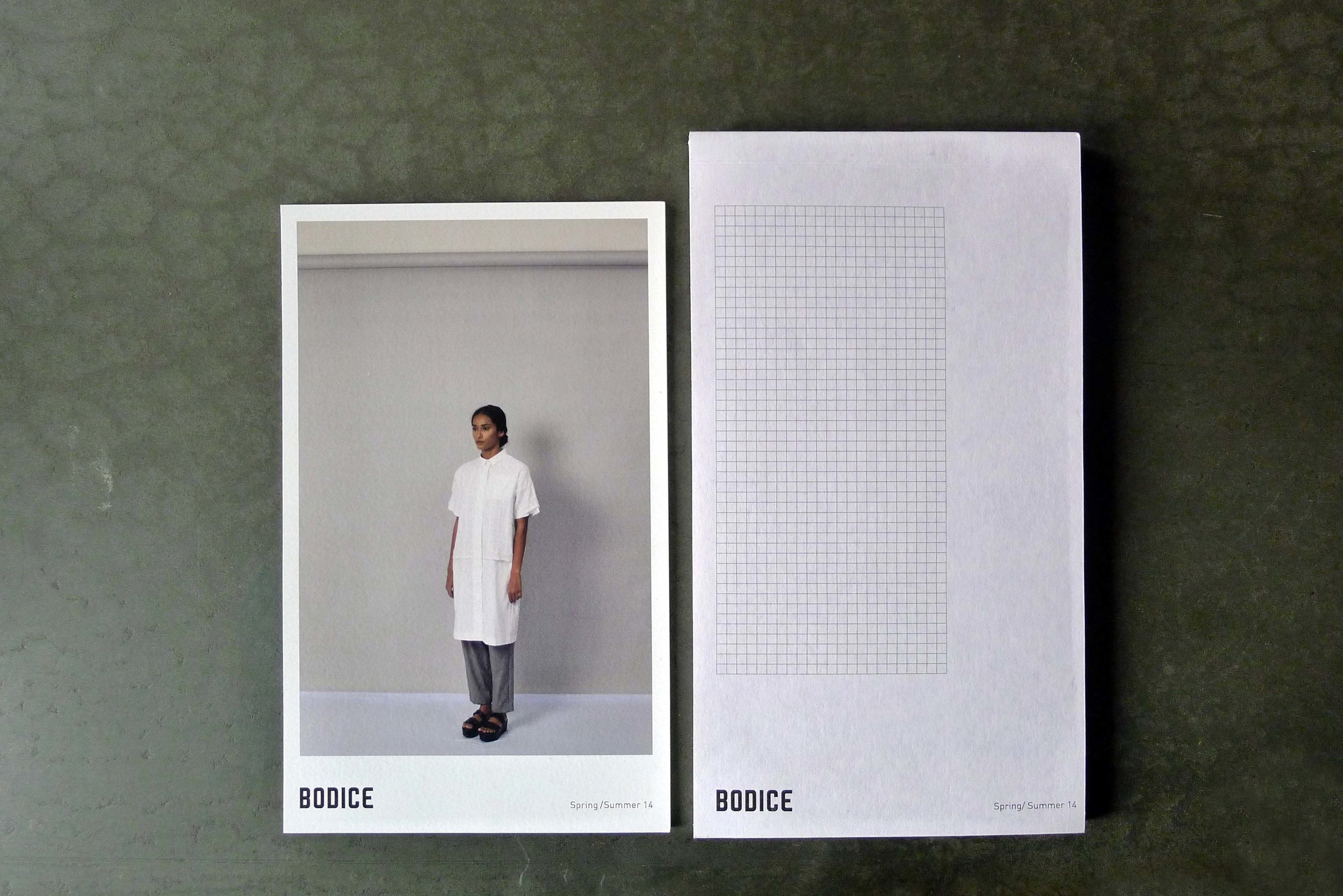
Brand identity for a fashion label in Delhi, India. Using the weft and warp of the fabric, a perfect square grid was used as a base to design the logo, stationary, the lookbook and other marketing collateral.


This animation was part of the email invite for the Wills India Fashion Week in October 2014. The logo was the main focus of the animation, with the location and other details interspersed with the logo.


The location of the store in Hauz Khas Village, New Delhi, India has very similar vibes to Greenwich Village or Soho in New York.


Some BTS photographs:
– BTS of the store opening
–Checking the colors at the printers’ office
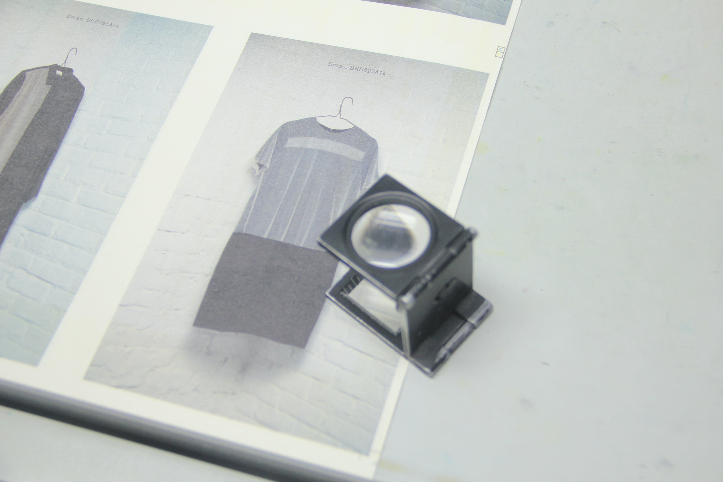
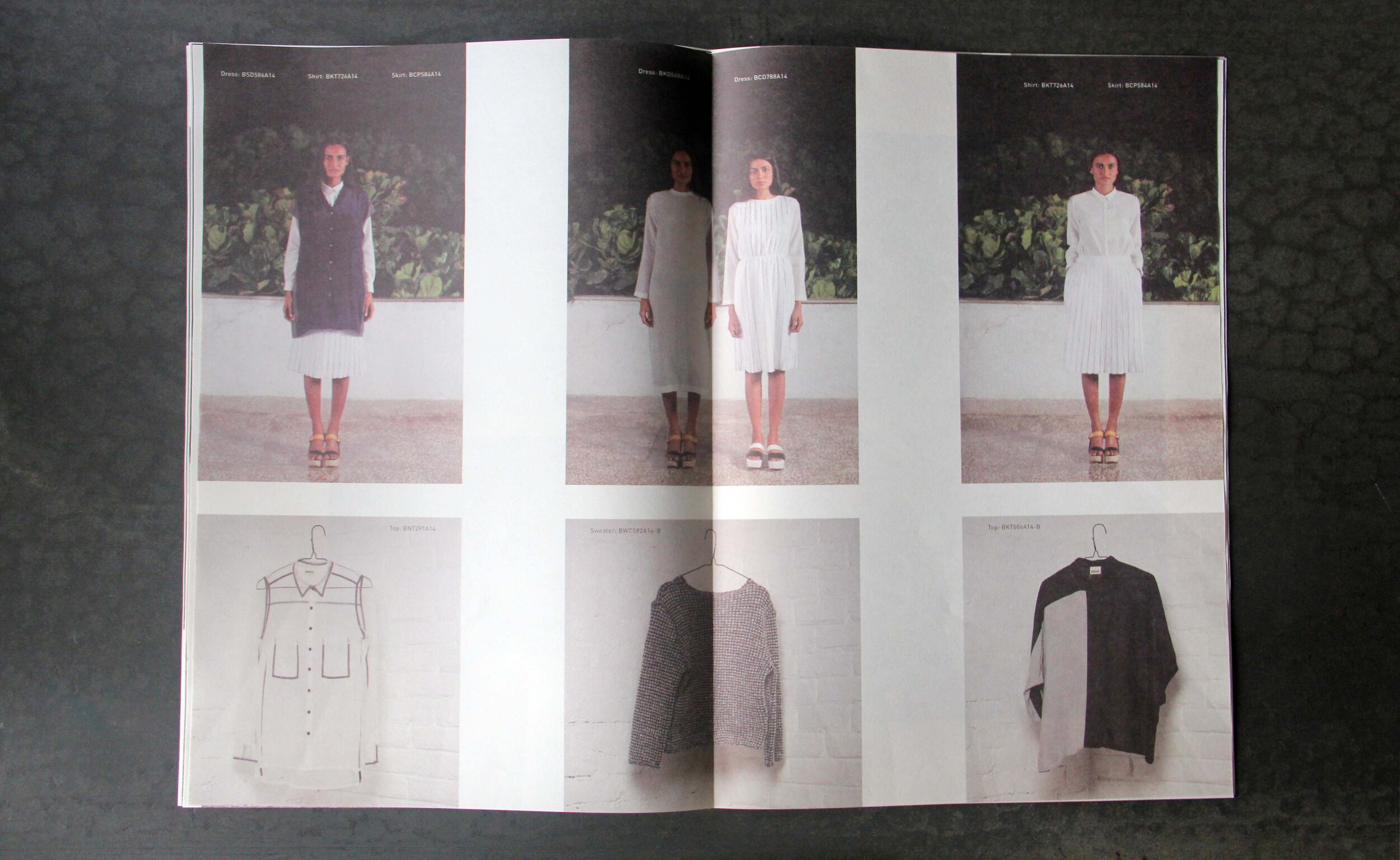
– Lookbooks for the A/W and S/S collection.
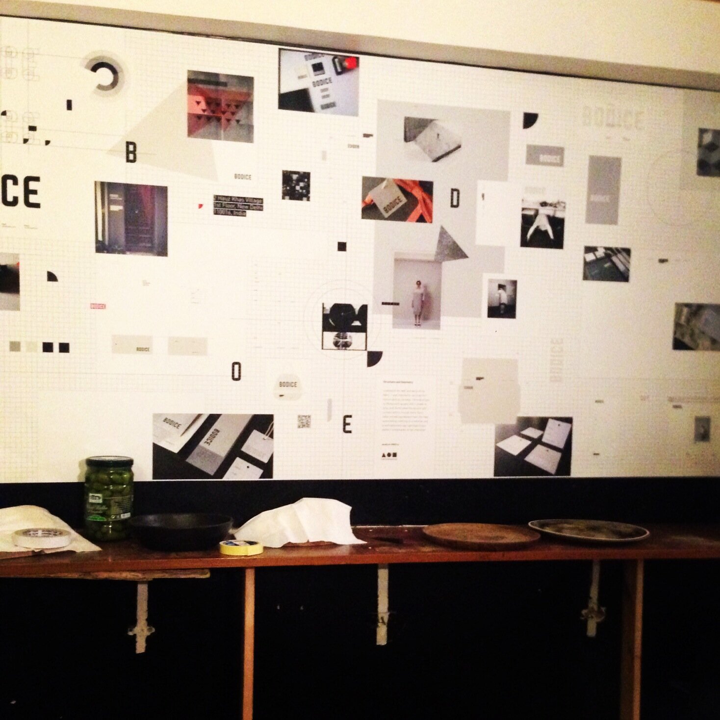

Custom typeface designed for Bodice inspired by the grid-like weft and warp of the fabric used for the different collections.
Check out some preliminary sketches as well. >>


Bodice works with integrating androgyny and the reinvention of classics with a subtle hint of irony. Based on the logo created by Aman Khanna, the creative director of Infonauts, a design firm in New Delhi, I contributed towards the design language and the overall brand of Bodice.
My personal interest in typography led me to design the complete typeface which has been constructed from the square grids and shares similar characteristics and proportions to the logo.
2014
Client: Bodice
Role: Brand development, Lettering
Creative Director: Aman Khanna
OTHER PROJECTS

