
Lloyds Bank: Reimagining the Digital User Experience
OVERVIEW
As part of the Interactive Media Practice program at the University of Westminster, I was tasked with injecting new thinking and strategy into the Lloyds digital products through in-depth research, prototyping and testing as it was seeing a sharp decline in new customers.
Company: Lloyds Bank
Time: 7 weeks
Role: Research, strategy, design and execution
Tools: Adobe XD, Miro, Zoom, UserTesting, Adobe After Effects

THE CONTEXT
In 2021, the global banking sector was suffering from low-interest saving rates. Legacy banks were also competing with challenger banks in terms of innovative technologies to improve personal finance.
THE PROBLEM
1. Customers were not budgeting and saving.
2. Not booking health insurance plans.
3. Not purchasing retirement products such as pension plans.

THE CHALLENGE: Research, strategise and design a value-driven user experience of the Lloyds bank app for new-generation customers (while still retaining existing ones).
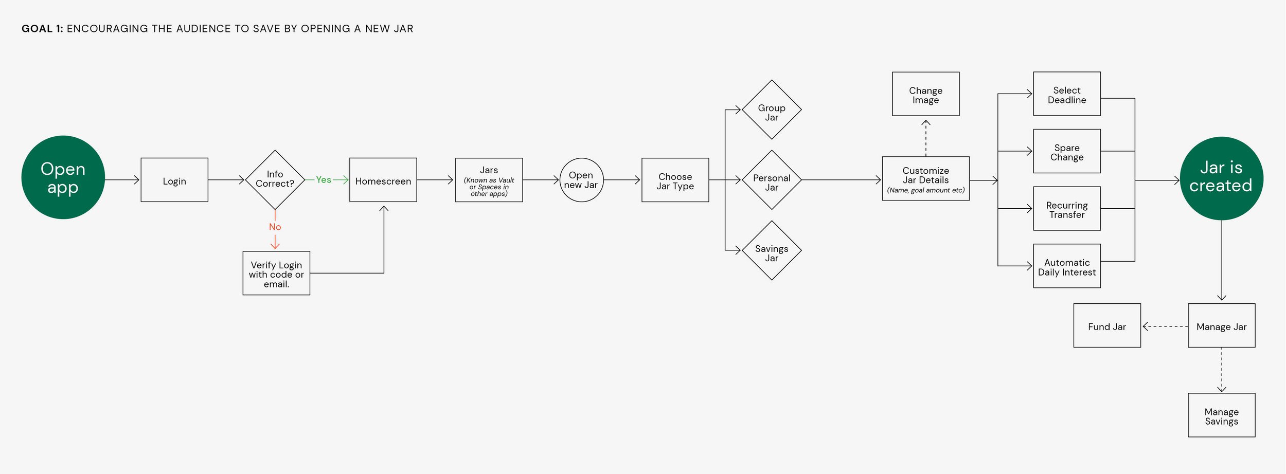
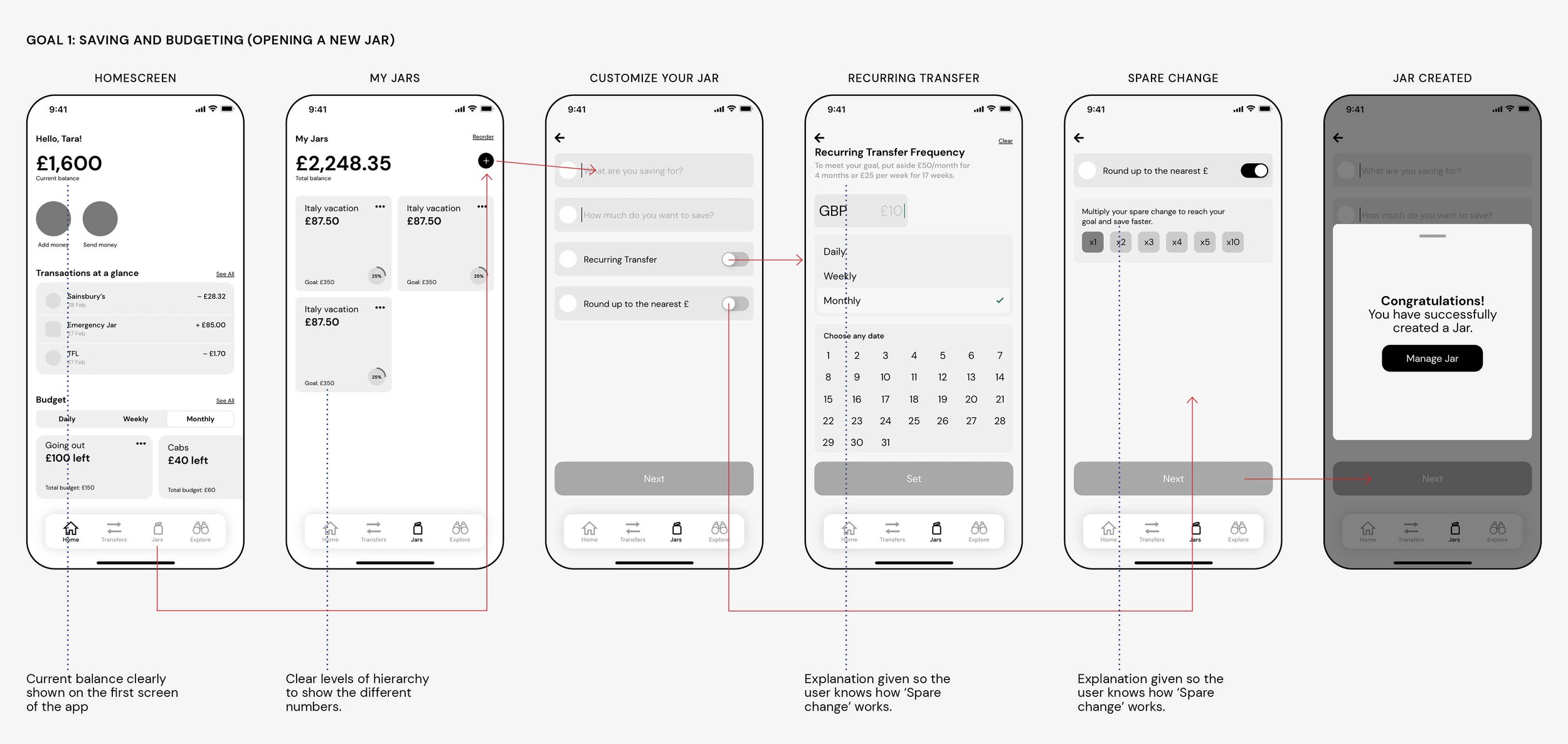
GOAL 1: Saving and Budgeting – Encouraging Millennials and GenZ to save by providing user-friendly tools for budgeting and investing.
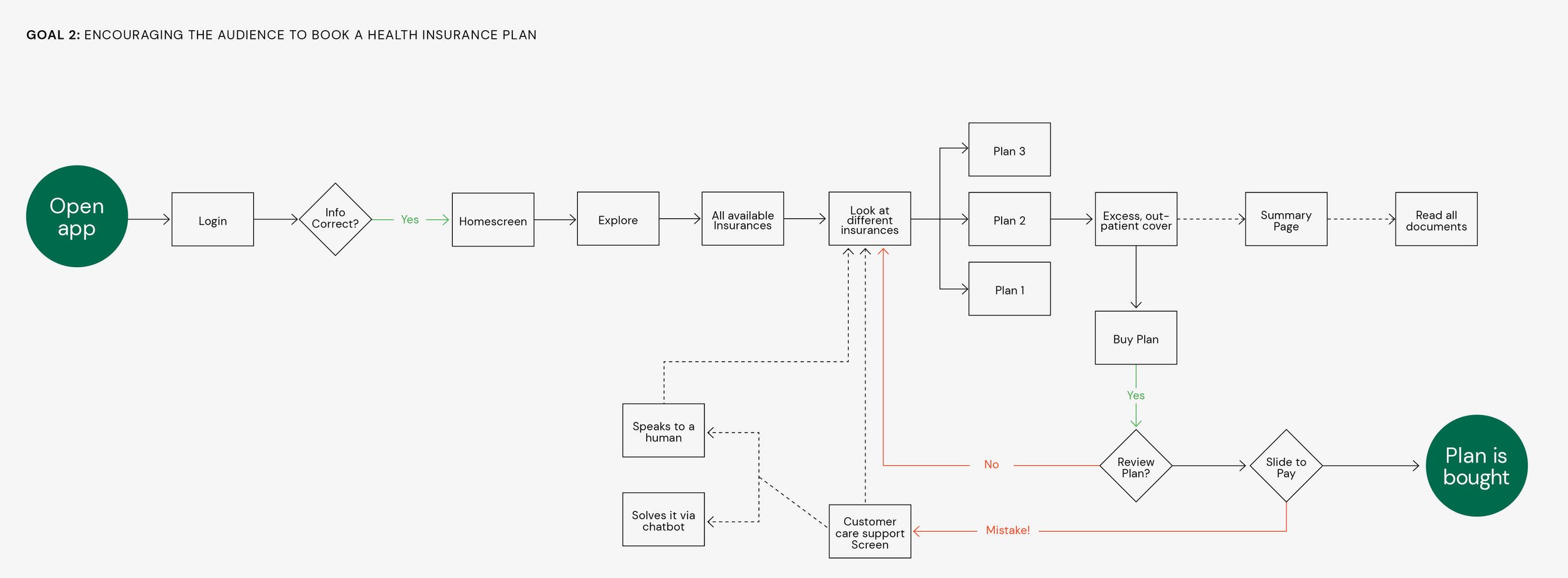
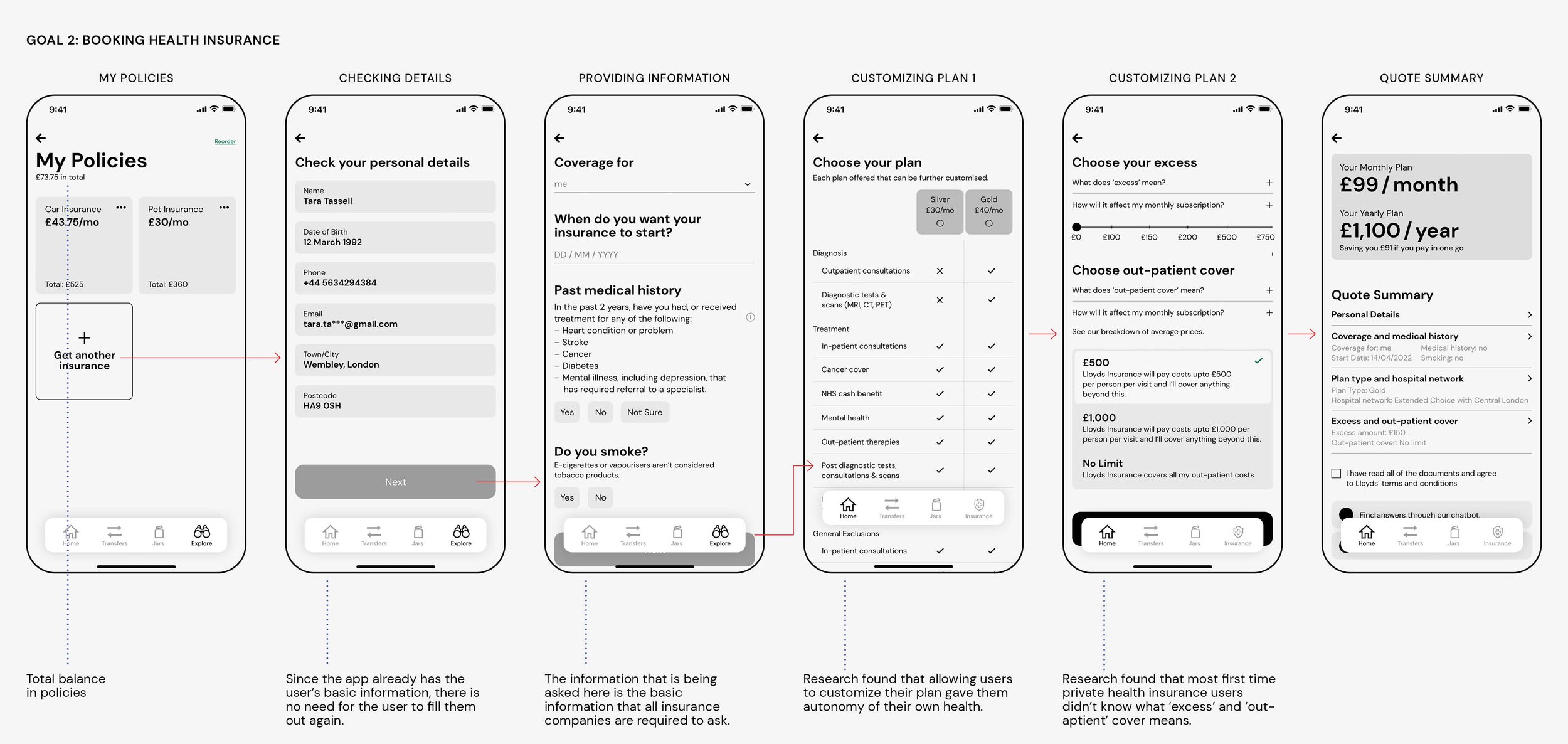
GOAL 2: Health Insurance – Identifying and booking private health insurance.
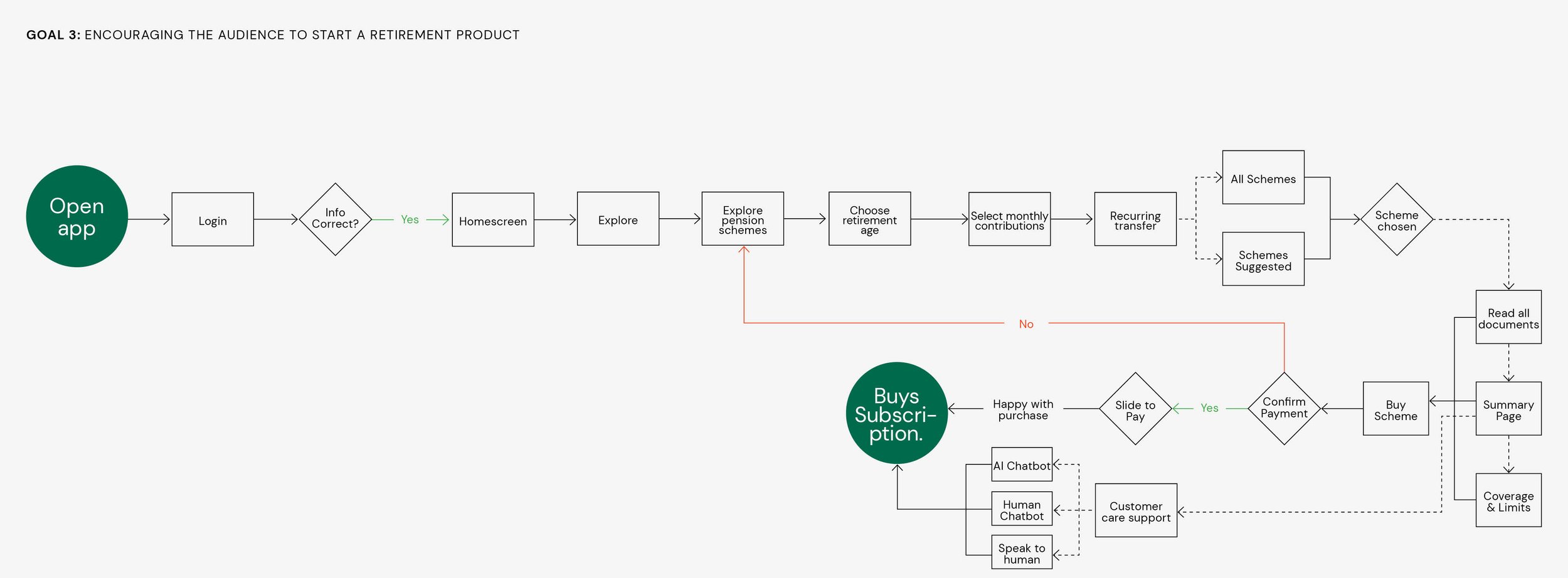
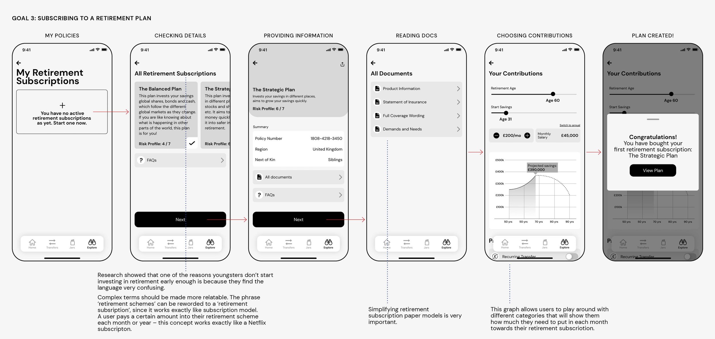
GOAL 3: Retirement Plans – Encouraging users to purchase a retirement product such as pension plans.
PROCESS
The Spiral Model Framework was chosen as it’s ideal for R&D projects and app development. It enables gradual releases and refinement of the product through each phase of the spiral.
Since this is a student project, the ‘gradual release of the product’ translated to showing the work to potential users and professors. In the real-world project, it would have been released in a phased-out approach over a period of several months to 2 years.

DESK RESEARCH
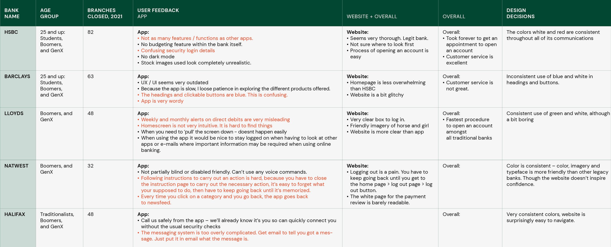
I started my research by understanding Lloyds’ reputation. Statista places Lloyds at the 4th position (out of 5) on the most valuable bank brands in the UK, and 10th position (out of 15) in the leading banks of Europe category – essentially, a pretty bad reputation.
Legacy banks like Lloyds are decreasing in popularity, especially for millennials and GenZ for various reasons:
Legacy banks ask for an unnecessary amount of paperwork in everyday banking as they haven’t upgraded their technology
Don’t offer as many features and functionalities.
Not as transparent.
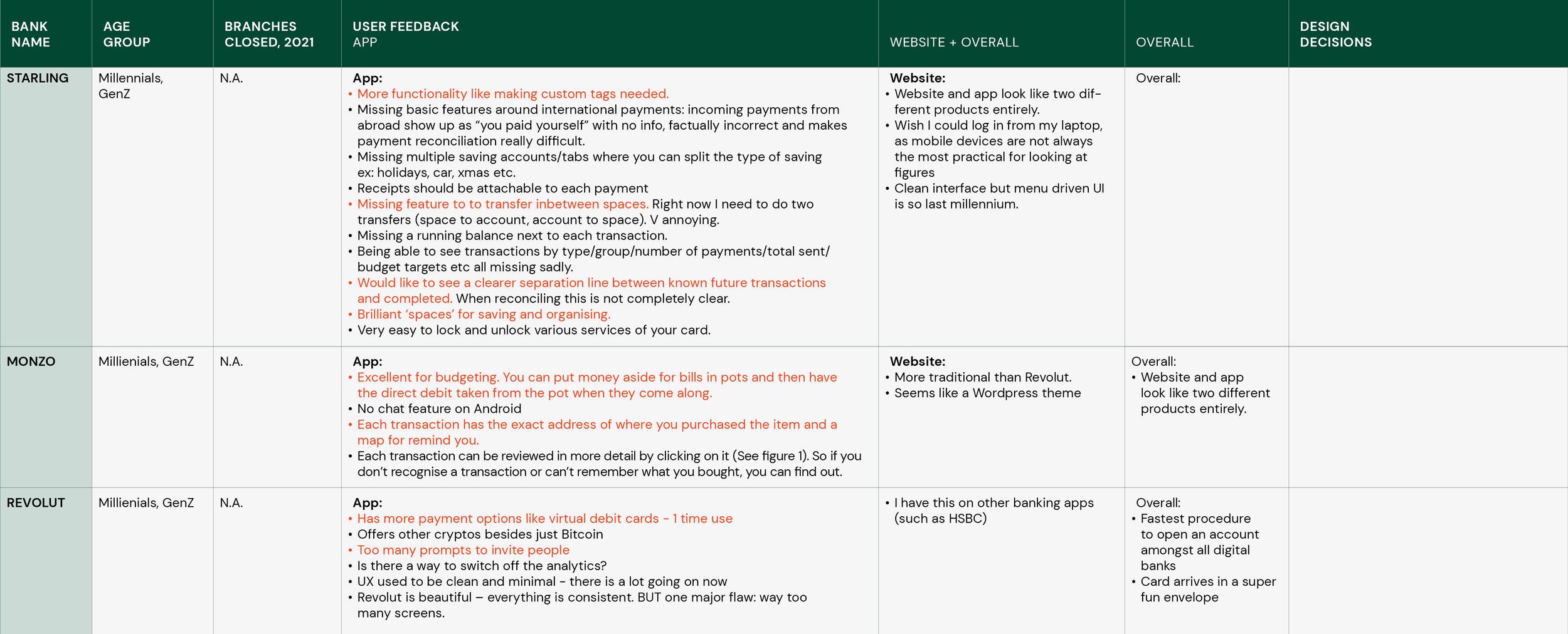
These hindrances provided a way for challenger banks like Lloyds, Monzo and N26 to disrupt the entire personal finance sector.

USABILITY EVALUATION
My first step was to explore the different functionalities of the Lloyds bank app. During this exploration, I documented 4 broad usability issues that I noticed.
Major user tasks or calls-to-action not prominent
Unnecessary information on main screens
No usage of the latest technologies
Page layout and UI is clunky

USER INTERVIEWS
I did an extensive 2-week research sprint, where I conducted user interviews and explored the comments section on Apple and Android app stores, Reddit and Instagram comment sections.
I conducted 5 in-depth interviews with Gen Z and Millennials who had bank accounts with various UK-based banks. The key takeaways were that customers need help with:
Save more after paying off mortgage payments. 👛
There are long waits at the NHS – prompting many customers to get external private health insurance.
A mobile bank app should have a supportive smartwatch app. ⌚


COMMENTS SECTION OF APP STORE, SOCIAL MEDIA
Terminology is confusing. Unnecessary information on the home screen.
Icons don’t clearly represent the exact meaning.
Transactions should have more details such as time and address besides the name.
“With Barclays, I have to open up my app every time to look at my balance. Very annoying. How come it’s not connected to my watch?”
“NONE of the traditional banks have the savings features like Vault or Spaces. I have two banks in Italy – N26 and Intesa Sanpaola. N26 has this amazing Spaces feature. It’s brilliant.”
“I use Revolut only because of its crypto/bitcoin feature.”
TARGET AUDIENCE
The audience chosen for the app redesign was GenZ and Millenials, as they will age into the key 25- to 40-year-old lending sweet spot in a few years. To lead and grow, banks must rise to the challenge of engaging these younger, massively consequential consumers through innovative new approaches to traditional banking. Getting it right will require more than adding digital features to legacy offerings.
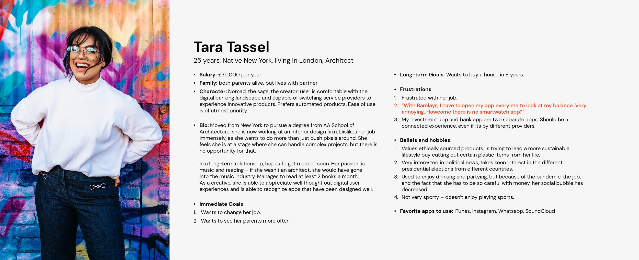
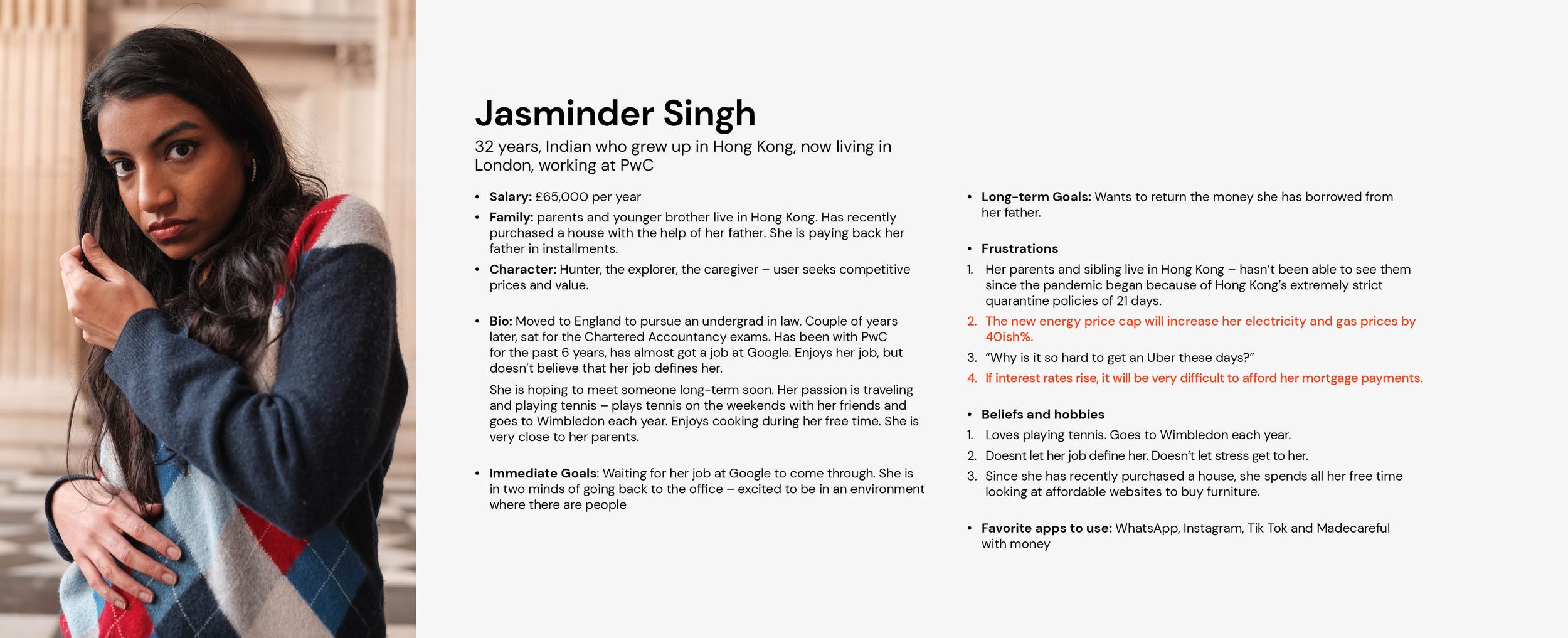
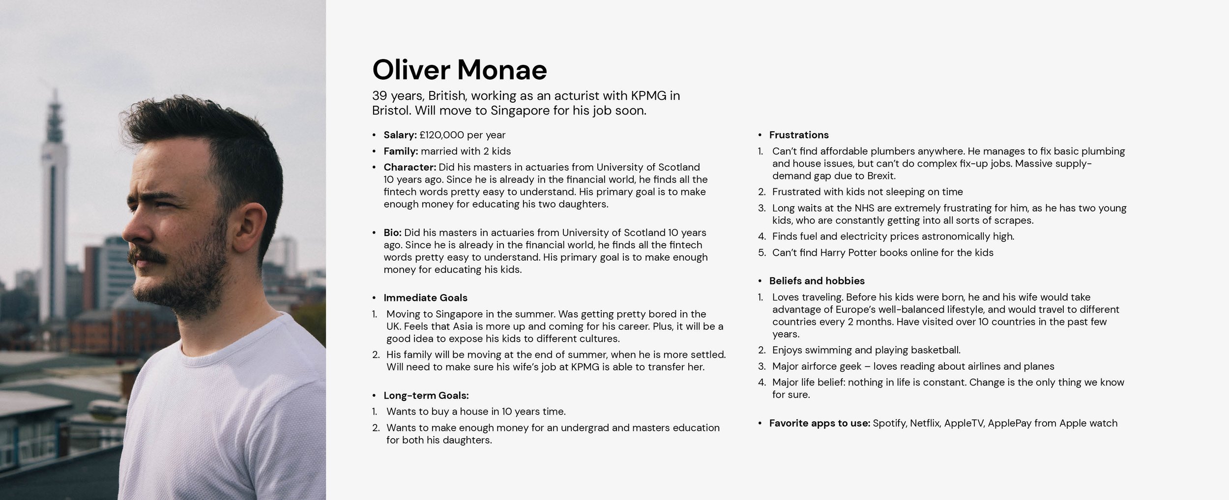
PERSONAS
Gen Z is currently studying and/or has part-time jobs. In a group of savvy digital bankers, more than a third have already saved £1000 and are likely to have the least amount of debt. Gen Z individuals check their bank balance once a day and use fintech apps that help them save money. Younger millennials are thinking of saving for significant investments (house/car), while older millennials are feeding into their long-term investments, such as buying a home. According to the Guardian, Millennials are regularly setting money aside, proving that they’re not as reckless as other generations seem to think.
Key Takeaways
Millennials and GenZ depend on recommendations from friends and social media.
Customers want the ability to personalise.
Tech-savvy customers are very aware of the existence of challenger banks.
EMPATHY MAP
Next, I mapped the response and thought of one user from each agegroup to understand their environment and emotional connection to digital banking. Having never done empathy maps before, this was an eye-opening experience!

CUSTOMER JOURNEY MAP
I illustrated the customer journey map for each age group based on the different goals. As mentioned above, the different age groups selected neatly (and magically) aligned with the different preset goals.

INFORMATION ARCHITECTURE
After analyzing the current information hierarchy on the Lloyds app, I realized that there were many UX errors. Taking all the factors into account, I designed a revised IA.
The section heading and icon did not necessarily relate to the content inside each section. For eg, under ‘Apply’, the content shown offers more than applying for loans and overdrafts. The icon is not clear either.
Many of the options shown under ‘More’ on the home screen are a repeat of other sections.
The second headlines are in bold and green – it often looks like the main headline.
Are titles like ‘everyday offers’ and ‘credit score’ so important that it needs to be on the home screen? Shouldn’t recent transactions be up front and centre?
Why is the line ‘Securely send money outside the UK’ highlighted in orange? Is that the main offering of the bank?

USER FLOWS
Once I got all the insights and data, and I had synthesized it in the form of personas, customer journey maps and Information Architecture, I needed to provide a better solution. As I developed the user flows for the goals, the 3 key takeaways were that:
Headings / terminology should be short
Users should get to their destination in 5 screens or less
Make use of pop ups when relevant so it doesn’t feel like a new screen
WIREFRAMES
I started with doodles on post-its so I could move them around before progressing to high-fidelity wireframes. An important question that came up at this stage was how similar or different should the visual design language be from the existing app?
I initially divided the app into 3 main sections: Home, Transfers and Jars. The main feedback I received was that I need to add another option in the menu bar that houses Goal 2 (health insurance) and Goal 3 (retirement plans). This eventually became the ‘explore’ button instead of a ‘profile’ button.
FEEDBACK
App algorithm should suggest how much the recurring transfer should be based on the goal within the deadline.
Simplify headings. Don’t use outdated terms:
– Transactions at a glance > Transactions
– Retirement plans > Retirement subscriptions
– Spare change > Round up to the nearest £The idea of ‘tucking in’ information under a plus icon doesn’t work. Users are missing it completely. Put an information icon instead.
Remove the circular plus icon and add the plus icon within the box.
Definitely have a chatbot.
HGH-FIDELITY GUIs
Taking into account all the feedback based on the wireframes, I proceeded to build out the GUIs. For each goal, you can interact with the Adobe XD file. Click on the green images below!


Interact with the Adobe XD file here.


Interact with the Adobe XD file here.


Interact with the Adobe XD file here.
Through the research and prototyping phases, it became obvious that integrating a smartwatch app was essential to a robust banking system. The smartwatch app has three high-level categories: Homescreen, My Jars and Explore – similar to what the mobile app has.


Interact with the Adobe XD file here.
A widget for iOS was also created that will allow users to check their balance quickly. This is helpful for when people don’t want to open the entire app (they may be in a public space) and want an overview. This widget resembles a screen under Goal 1: Saving and Budgeting.

The debit card was redesigned along with the notifications banner. In the UK, a majority of people, especially this project’s target audience use their cards through Contactless. Its vital to offer that feature in a technology-friendly bank.


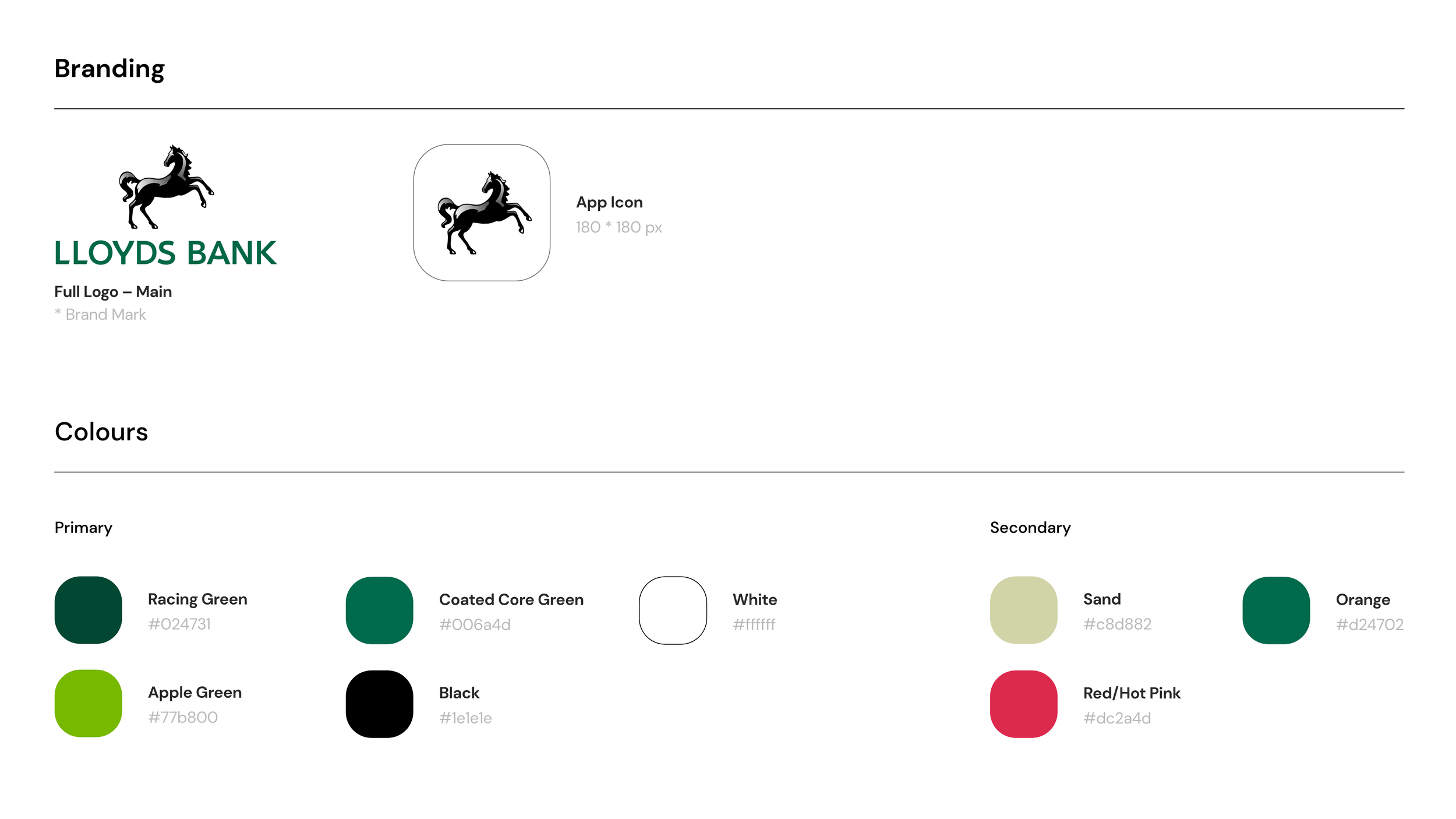
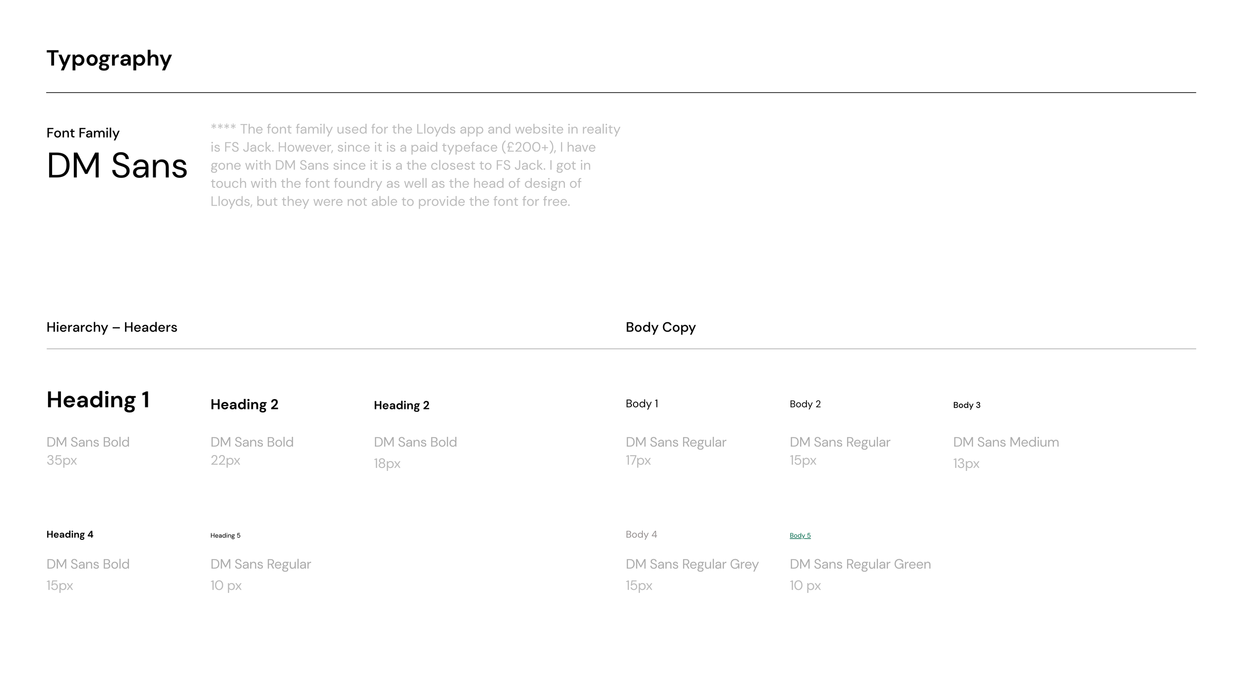
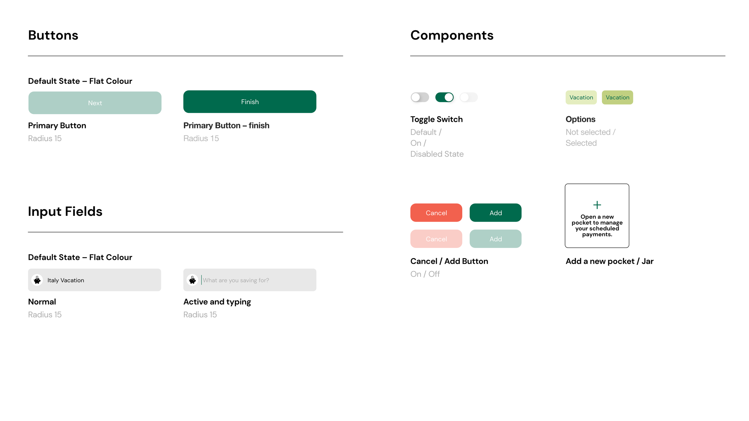
The entire project was consolidated with a design system. By creating a shared language and visual consistency across different pages and channels, it creates a unified language within and between the different verticals of the bank’s different digital touchpoints.
OTHER PROJECTS

